
illustration by Bobby Casumbal
I'll never claim to have a rich understanding of finances. But this morning, while listening to NPR and eating my delicious yet financially indulgent (from a grocery point of view) Kashi breakfast cereal and drinking a nice cup of coffee, I was listening to the Marketplace Report. Their news? Either things are going to crash, or they're not. We just don't know.
During my semi-daily bout with procrastination today, I came upon this fine story. It's a great exposition of interest rates and inflation over the course of the last half-century, opposed to several market-indicating staples of the economy.
For those among us who have been content to allow the market to flap in the breeze because they simply don't have enough market-based capital to care (like me), this helps to bring home the real consequences to ordinary folks--such as a nurse who can only count on a 3% annual raise--of flagging money value and the price of goods.
As borrowers and lenders regard each other with mutual wariness, things are drawing to a near stand-still. This is particularly evident in our declining manufacturing sector, where financing large capital investments has several positive ripple-effects: it keeps cash in circulation; requires the manufacture of durable industrial equipment (a sector that used to be reliably domestic); and finally, presages job growth and security in the one part of the economy that was once the cornerstone of the middle class.
This brings me to another grim observation: it's axiomatic by now that the middle class is shrinking. In part, that depends on your definition of "middle class." It has been a habit of our government (and I'll not single out the current administration here) to define that upwards.
Check out the following chart:
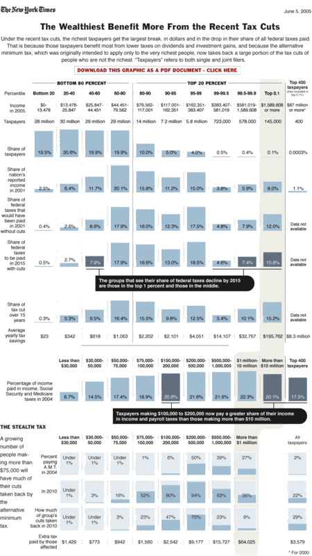 I'm sorry if that's not easy to read; you can get a better look at if you click on the image, I think. I want to point out two subtle (maybe not-so-subtle) things about this chart.
First: 80% of taxpayers make less than 80,000 dollars per year. The graph itself underplays that fact by squishing them into only 1/3 of the total space. In order to see this graph as a true illustration of income spread, you need to read the top 20% as a single data point on the top line. In other words, according to income, anyone that makes more than 80,000 is firmly upper class.
Second: The "Bush tax cuts" shift the burden largely within that top 20%, with the lion's share borne by those making from 80-380,000 dollars. That in itself is absurd, given the marginal value of money. In what way is an income of 380,000 similar to an income of 80,000? It's a vast amount more. (For a primer on the marginal value of money, see here (in a post on social security).)
Even more perverse, however, is the fact that .2% of the shift will redound to the bottom 40%. Your taxes, relative to the rest of the country, will actually increase over the next 7 years if you make 25,000 or less. How's that for a kick in the teeth? Ever try living on less than 20,000? From experience, I can tell you that Top Ramen gets old pretty quick (though you can dress it up with a can of tuna).
Anyway, back to the "middle class." Bushco pushed these cuts as a middle class tax cut. And, if you make between 25-45,000, you'll eventually see a savings of .7% (relative to the rest of the country). But if you make $580,000 or more, you'll see a savings of 1.2%. Go figure.
But what really grinds my gears (thanks, Peter), is the way this regime treats everyone from the 60th to the 90th percentile pretty much uniformly. There is nothing similar between making 44,000 a year and making 117,000 a year. Nothing.
Also notable is how the percentiles bracket incomes: Folks who pull 44k are in the same bracket as those who pull nearly twice as much. Not only have real wages stagnated, but the curve of living standards have drifted to the right given that stagnation. A 44k income today is like a 30k income a decade ago. And right on down the line. A middle class standard of living has slid up the chart, while the true middle of the income curve in real dollars has slid down the chart.
Today's economic news presages more of the same.
Start with what the Bondad article tells us (you can check out bondad's site here for more analysis) about prices and inflation. Now put it up against this:
Philadelphia Federal Reserve Chair Charles Plosser said that we'll skirt a recession. On the other hand, San Francisco Fed Reserve Chair Janet Yellen is more pessimistic. So...
We just cut the inter-bank lending rate by 1/2 a percent. We're already near 50-year lows on that. There isn't much more room to maneuver. As bondad points out, the eyes of the Fed have been on "core" inflation (not focused on commodities, in other words). In the meantime, prices for everything I use have been going up. The only thing not on the rise is the value of the dollar and the real value of my wage.
Brother can you spare a dime?

No comments:
Post a Comment